Tue, 24 May 2011
Mysterious Source Code
About a month ago, I have spotted a two-page listing of source code in our printer room/kitchenette. I have glanced over it briefly, and during subsequent visits to the room, I became more and more fascinated by it. Finally, about a week ago, I have grabbed it for myself, because nobody seemed to care about it anymore. So here it is, in all its glory:
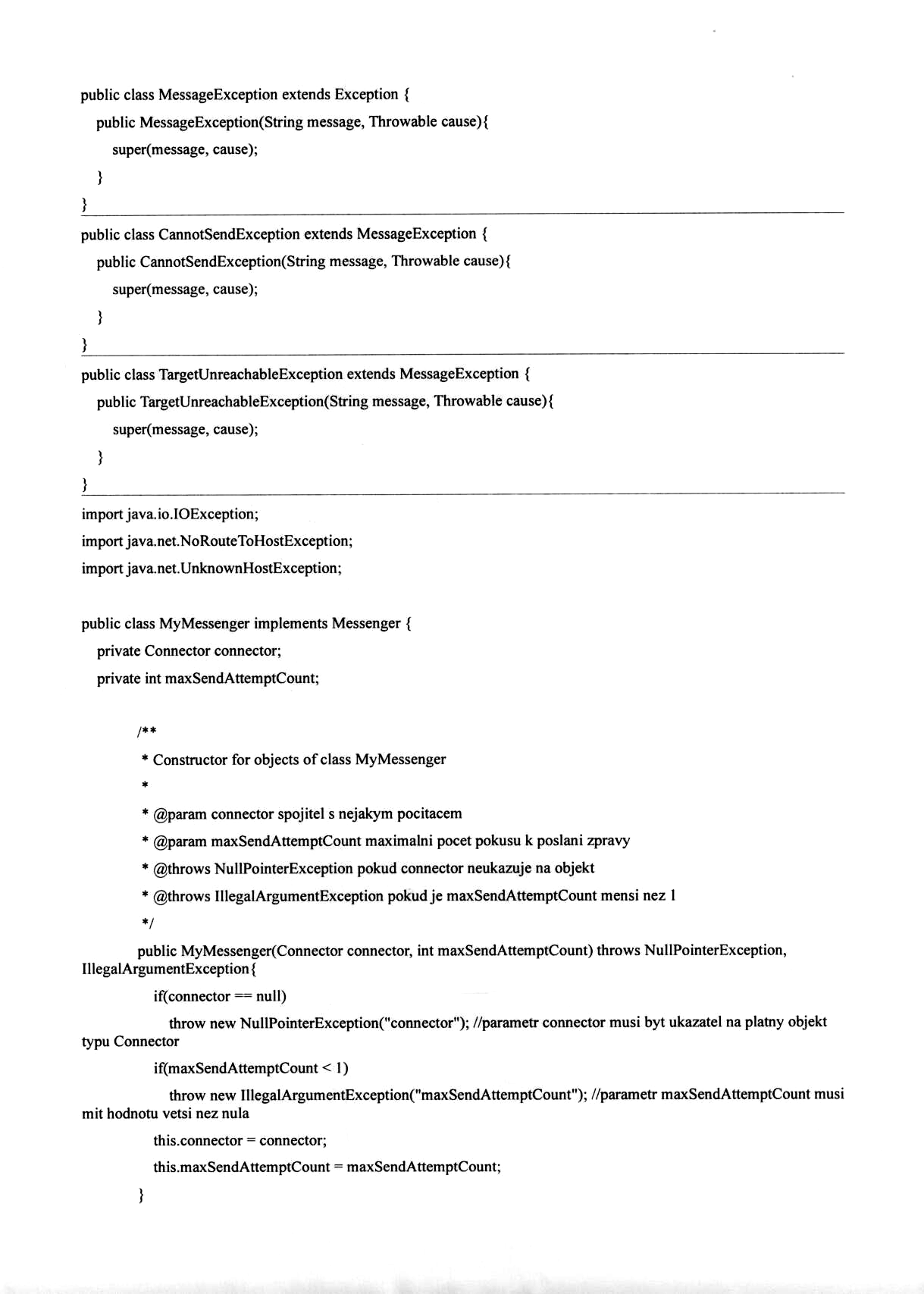
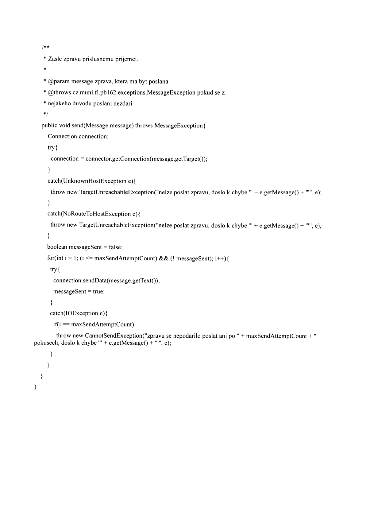
Click the thumbnails for full-size images. Sorry for not providing a plain text version, and sorry for the Czech language in the comments. I have two reasons for which I find it really fascinating:
- There are two pages of source code, which does literally nothing. It only wraps an existing class with a new one with marginally different API (two exceptions joined into one exception, and retrying in case of failure). Nobody sane would write these two pages by hand, so I expect the code has been at least partially generated by some IDE. Obviously nobody can expect the code to be read by a human (actually, not read, but carefully examined for traces of some non-trivial application logic, should there be any). So I wonder what the present meaning of "the source code" phrase is, when it is no longer written nor readable by humans.
- The only real "application logic" is the
for-cycle near the end of the second page. And even this has been totally destroyed by the "every block should have only one exit point" mantra of the programming theoreticians. Adding a simplereturnstatement when the message sending finally succeeds would save them the following:- a boolean variable
- a complicated condition in the
for-cycle - an
ifstatement when the maximum number of tries is reached
I can only hope this is some kind of a silly example and not a real assignment given to the students of the Programming in Java course. I think the students have to be taught that mid-layers are root of all evil, and not some highly theoretical (read: impractical) rules like "goto is evil" or "a single exit point only".
4 replies for this story:
gRis wrote:
I would have said it is a code snippet for the Public Administration Informatics guys, but it reminds me too much of the atrocities we used to create in PB162 several semesters ago. I suggest you ask in the course discussion forum, or submit it to TDWTF.
himdel wrote:
Nope, this was an actual PB162 homework, I remember having to write something very similar. Courses like this are what made me really despise Java (I don't, anymore, but I still think it's rather silly). However, IIRC it was meant to teach about chaining exceptions, which it probably does well. And while they might have taught the single point return nonsense, there were only automated tests so the student who wrote that could have written it better.
EL wrote:
Having taught Java (meaning I was the "teacher" on the excersises for two terms) I'd say that this is just silly looking excersise, with empasis on the word looking. My guess is that this is a way to teach students how to use exceptions (which you have to do a lot in Java). Normally, on such a small piece of code, you wouldn't bother, but this is how the students IMHO get used to the exceptions. BTW: While I understand the "old programmers" desire to minimize the amount of variables etc., from my point of view there are two most important things that should be considered regarding a source code: - readability (that includes consistent coding) - the best available complexity (in the terms of computational complexity) So in this case, the return would definitelly make more sense than the overcomplicated condition, but the (non)existence of the boolean variable doesn't seem so relevant (although it vanishes from the code as well as a result).
EL wrote:
Ooops, sorry for the (non)formatting, I tought it would be preserved.
Reply to this story:
Mon, 23 May 2011
Lost GUI features
Contemporary GUI applications have several problems which, if I remember correctly, previous systems did not have. I wonder whether somebody else also considers it being a problem:
- Creating a new file
- Almost every TUI text editor (like
vim) happily accepts a non-existent file
as a command-line argument, and the straightforward interpretation is
"user wants to start working with a new file". On the other hand,
most GUI applications simply complain that the file does not exist,
and some‒like OO.org‒exit after that
message. Other GUI apps,
like Gnumeric, present
a warning, but then open a new work with the default file name
(
Book1.gnumericin the case of Gnumeric) instead. - Working directory
- The file open/save dialog of contemporary GUI apps does not offer
by default the working directory from which the application has been started,
and uses some silly default (such as
~/Documentsin case of OpenOffice.org). Even gThumb needs to be explicitly told that the user wants to browse the current directory with the "gthumb ." command line. - Iconified applications
- Once upon a time, in a stone age of GUI computing, there was a twm window manager. When the application window was not needed on the screen, twm could be used to iconify the application. All applications, and all instances of them, could be iconified and then restored back the same way. Then Windows 95 happened, and it started to minimize the applications to the bottom panel instead of iconifying them to any place in the desktop. It also reused the desktop icons as application shortcuts instead of representing the minimized running applications. Unfortunately, the panel was too small for so many running minimized applications. Users stopped expecting to be able to restore the application after minimizing it. The applications which required to be minimized and restored back frequently (music players etc), developed their own means of minimizing, the notification icon area. So we have the iconification back, only not usable from all applications, and with each application implementing it in its own crappy way.
So what other important features of the "desktop of the past" do you consider missing from the present GUI systems?
UPDATE 2011/05/23: Iconified Apps
I have just discovered that XFCE4 in Fedora 15 allows the desktop icons
to be switched between the Application launchers/shortcuts and Minimzed
applications modes. Yay!
8 replies for this story:
Jiri Appl wrote:
Actually KDE apps still adhere to the first two points. Or at least kwrite and kword do. As for the iconified applications, kwin supports showing only the title bar of a running application.
Jiri Appl wrote:
Actually KDE apps still adhere to the first two points. Or at least kwrite and kword do. As for the iconified applications, kwin supports showing only the title bar of a running application.
Obvious Troll wrote:
Well, why don't you go and fix it? It's not like they're Microsoft apps, right? ;-) On a more serious note, I completely understand your frustration. I have to spend hours fixing (i.e. reverting crappy GUI decisions) applications every time a major release comes out. It feels as if there were some saboteurs writing bad code to make us switch to commercial software. I already did that in the case of Microsoft Office.
Yenya wrote: Re: Obvious troll
Why don't I fix it myself? Well, I expect the said behaviour is intentional so the patches will not be accepted. And I don't want to fork it. As for MS Office - their Ribbon UI is a prime example of what I _don't_ want to use.
Obvious Troll (not anymore) wrote: Re: Yenya
I am not convinced that it's entirely intentional. To me it seems more like something no one thought or cared about enough to fix. Anyway, you could either make it an option in settings or, in the case of creating a new file, turn the alert into a dialog. Regarding MS Office, I still have the pleasure of using the old UI as I have Office 2003. I wish they left the old UI as an option, but apparently one just _can't_ have it both ways. Anyway, the features are more than enough for the work I do and as long as there is some backward and forward compatibility, I should be fine. Maybe the problem lies not in the fancy new UI, but within us. Maybe we're getting obsolete almost as fast as our computers, and are being phased out by the young and progressive users. And maybe I should grab my cane, take out my false teeth and end this rant :-)
Milan Zamazal wrote:
IMO a sane user uses OO.org just as a document viewer or to edit (when being forced to do so) documents delivered to him. So complaining about a non-existent file makes sense to me. It's not a bad idea to use separate directories for different purposes so it makes sense to offer something else than cwd (that is typically $HOME) as the default directory. Of course, a civilized application should be extensible and so the default directory should be settable to anything (including cwd) by the user but that's another problem. As a user of an extensible tiled wm I don't understand why to waste screen space for either window bars or any kind of icons. A music player definitely doesn't require to be "minimized", my wm simply puts it automatically in its own workspace bound to a given hot key and the most frequent player operation (play/pause) is bound to a multimedia key on my keyboard without the need to display the player at all.
Yenya wrote: Re: Milan Zamazal
IMO tiling WMs suck. The main problem with them is that they resize xterms, and I want my terminals to have exactly 80 characters width. Another problem is that without window decorations, it is not easily visible which window has focus (which is also my objection to most themes of the non-tiling VMs; some of them display focus state only by changing the title bar, not the whole decorations). And music player in its own workspace? Having to switch to that workspace every time I want to do something nontrivial with it? No way.
Milan Zamazal wrote:
Tiling WMs are not for everyone, but they don't waste screen space and your complaints about them are invalid. If you always use the same font for your xterms, you can arange your workspace to make them 80 characters wide. Or you can use a floating window group (workspace). You can customize frame decorations to make the focused frame more visible if you want. I don't understand what's the problem with switching workspaces, you just press a hot key to switch to the player's workspace and another hot key to switch back to the original workspace. Don't forget that tiling WMs are based more on logical than visual concepts – and it's not easy to get free of some stereotypes (my own experience).
Reply to this story:
Fri, 20 May 2011
GNOME 3
After installing Fedora 15 in a virtual machine, I have decided to give GNOME 3 a try. Firstly, it is really slow over VNC. While GNOME 2 has been pretty usable for testing various new applications in a virtual machine, under GNOME 3 it is almost impossible. Here is a screenshot on which I will demonstrate my problems with GNOME 3:
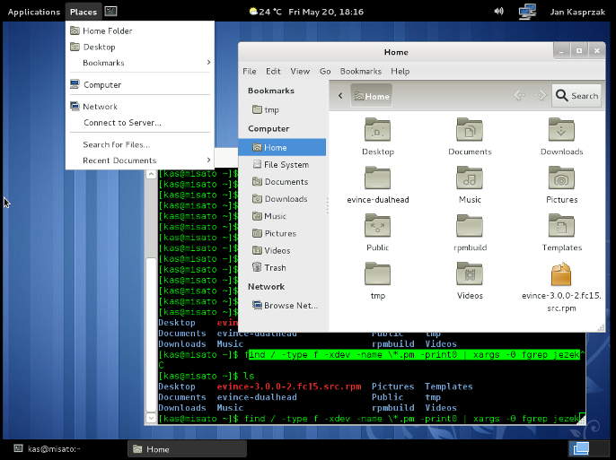
Firstly about the file manager. I use mostly command line for managing
my files, but using a file manager is sometimes handy nevertheless. One
of the features I often use is the "Places" list. In GNOME 3, it is presented
differently in the Places menu and in the file manager itself, which
is a clear usability bug. When I wanted to add another directory there
(I often use ~/tmp as my sandbox),
it took me at least 10 minutes to discover
that "Bookmarks" is what I probably want. And even then, the newly added
bookmark is added to a submenu instead of the main Places menu.
Also, I did not found any way how to remove those useless predefined
directories like Videos, Music, etc.
from the left sidebar. Even when I have deleted them from my home directory,
they still remain in the sidebar.
Another ugliness is that the new window manager does not decorate the windows properly, and instead relies on the applications themselves to provide things like resizing handle in the lower right corner (see the gnome-terminal window). Not only it looks ugly as hell, it also obscures the space the application expects to be visible. I will probably file this as a bug report when F15 is officially released, but I expect in a truly GNOME-ish fasion it to be solved by removing the "scrollbar on the left side" option :-/.
Anyway, it seems that XFCE+Sawfish combo works as expected, so I am definitely leaving GNOME when I install F15 on my workstations.
6 replies for this story:
thingie wrote:
You don't get "real" Gnome 3 without GL compositing, the new WM (not this one) needs it. It is quite different from this and it also has a new panel, without "Places" or "Applications". Given that even "ordinary" 3.0 is still rather incomplete, it's no wonder that this fallback environment is lacking even more.
Vašek Stodůlka wrote:
My desktops were Afterstep (doen not seem to be alive) - Windowmaker (similar) - waimea 0.4 (furter version were totally something else) and then went to gnome. It was not great, but everything worked and I liked the GUI simplicity. Now it looks also to xfce migration, or maybe I will go back to Afterstep, just for fun. I liked downloading plugins as source and coppiling that tiny-lovely one file binaries. I feel like i want to go back to the roots for a while.
Karel Zak wrote:
yum install cdargs ... for command line "bookmarks".
Yenya wrote: Re: thingie
I stand corrected, thanks! I have tested a real GNOME-3 on a physical machine (my wife's laptop :-), and after using it briefly, she is also migrating to XFCE now. For me, GNOME-3 looks like a smartphone/tablet UI - oversized title bars and scrollbars are the prime example of that. BTW, does anybody know how to add my own program/script to the list of favourite applications? Do I have to write the .desktop file for it?
Yenya wrote: Re: Karel Zak
Karel, I can manage my command line pretty well, thanks for asking :-). What I wanted was to have ~/tmp in every file/save dialog.
Yenya wrote: Re: Vašek Stodůlka
What I liked on GNOME-2 was the integration with hardware - it was usable even for my parents. Also the file manager was pretty good. For the first time after many many years I have used a GUI file manager when reviewing the documentation for the new faculty building. It was a three-levels deep directory tree with files named with mixed case, spaces and diacritics (often in more than one charset inside a directory).
Reply to this story:
Tue, 03 May 2011
Rethinking Cron
cron(8) is one of the oldest tools in UNIX. Despite of that,
I think cron is not something to be proud of. In my opinion, it
falls to the unfixable designs
category.
The recent attempts to fix it (factoring out atd(8),
a dirty hack that is anacron(8), etc.) show some of the problems
of cron. My recent experience confirms it:
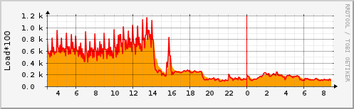
This is the load average graph from our server, which runs periodical jobs of
IS MU. Around 2 pm, I have rewritten the
main crontab joining several similar tasks to one line, and adding several
seconds delay between their startup. The groups of tasks are now started by a
simple Perl script which handles redirecting STDOUT and STDERR, and handling
the return code. The Perl script is started using exec in the
crontab line, saving one more process.
This way, I have managed to get the number of jobs which are
simultaneously started in the peak minutes of an hour from 155 to 13.
The system does exactly the same amount of work as before, but most of the
work is evenly distributed across the whole timeframe, not started in parallel
the first second of a minute.
This is one of the big weaknesses of cron. I think the future
cron will need to support the following use cases:
- Starting jobs approximately in a given period, but not exactly at the beginning of a minute.
- Starting jobs the given period after the previous instance has finished (and maybe warn if the previous instance keeps running for too long time).
- Run the job weekly, near the beginning of the weekend (not at some random
time as
anacronand/etc/cron.weeklydoes). See Fedora bug #671076. - Start a job several times in parallel (depending on number of CPUs or something like that), and restart them after some of them finishes.
What periodical and semi-periodical tasks scheduler do you use? Will
systemd
be the answer to these problems?
2 replies for this story:
Vašek Stodůlka wrote:
I miss the feature not to start when previous instance of the same line is still running. I use "lockrun" for this, but it is not a package in most distributions, so it has to be some better way...
xbezdick wrote: systemd
Lately when I was complaining about systemd somewhere I mentioned that it's already big enough to take over from cron and do even it's job...