Tue, 20 Oct 2009
Framework?
When teaching, the questions from the audience provide an important feedback to me - a notion of whether I was successful in passing the information to the audience, and what to improve or explain in a different way. There are, however, rare occasions when the question just makes me think "WTF?".
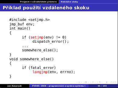
Yesterday I tried to explain the
setjmp(3)/longjmp(3)
semantics. These two functions are not straightforward, and it probably
takes a while to wrap one's mind around them.
But after that, the usage is quite simple:
the target of the non-local jump is firstly initialized using
setjmp(3), and later the jump itself can be made using
longjmp(3). I have written the following code snipplet
to demonstrate it:
During the lecture when I asked whether there were any questions, the question
was: "But is there any framework for those functions?".
I was totally puzzled:
I probably don't know all the meanings of the English word "framework",
but I think it means something like a higher-level abstraction or environment
to wrap the lower-level things in order to make them simpler to use (often at
a cost of freedom of how to do things). But can this fancy goto
be made even simpler than it is? It would still be necessary to declare
the label somehow (setjmp(3)) and then jump to it
(longjmp(3)).
WTF? What framework?
5 replies for this story:
Hynek (Pichi) Vychodil wrote: framework
'framework' is just magic word. When you hear 'framework' you should hear 'abrakadabra'. 'abrakadabra' will solve our problems with performance. Bullshit, it is anopther layer which must make worse performance. 'abrakadabra' will improve our productivity. Bullshit, people would learn it first and then can be more productive if ever. You will usually must cope with framework bugs and restraints. 'abrakadabra' will solve our problems with scalability. Bullshit if there is not scalability involved in your solution yet and framework have to support it. Framework is cargo cult or incantation for people which would not like think.
Milan Zamazal wrote:
I guess the construct looks just unnatural today, when most programming languages in common use provide exception handling. For first, people aren't accustomed to meet and use goto constructs. For second, there is usually no need to make exception handling explicit ("if (fatal_error) ..."). For third, error handlers are typically declared in more elegant ways, e.g. `trap' (shell) looks more natural than the setjmp call. So a person who haven't been exposed to roots of our generation (BASIC, C, assembler) can't match your example to his standard patterns and may think there *must* be a less ugly way to do it. Is it the first time you have felt like the young generation can't understand you? ;-)
Yenya wrote: Re: Milan Zamazal
I have been thinking along the lines of "Java generation can't understand me" rather than "young generation can't understand me" :-)
Pathconf wrote:
If you are teaching on the school where Assembly language is a bad word and for every C oriented course there is a dozen of Java oriented, what do you expect?
t8m wrote:
What they probably want is: #define DECLARE_LABEL(x) jmpbuf x #define DEFINE_LABEL(x) if (setjmp(x) != 0) #define JUMPTO_LABEL(x) longjmp(x, errno) Which would make the code more obfuscated as is the desire of the true framework programmers. :)
Reply to this story:
Fri, 16 Oct 2009
Terminal Font
Today I have read an announcement of the Anonymous Pro font, which should be optimized for text terminals and for the programming environment. As this clearly matches my use case, I have decided to try it.
I was soooo disappointed. I may be too used to the font I use (Lucida Typewriter, the upper part of the image), but I think Anonymous Pro is clearly worse.
Which terminal font do you use? And how does it compare to Anonymous Pro or some other fonts?
12 replies for this story:
scrool wrote: Inconsolata
Couple weeks ago I've started to use Inconsolata (http://www.levien.com/type/myfonts/inconsolata.html). It is somewhat similar to MS Consolas which doesn't look on *nix systems (Cleartype). Inconsolata is optimized for use with antialiasing enabled otherwise it looks quite ugly. IMHO it is quite usable for sizes from 12px to 9px. Btw. take a look at Top 10 Programming Fonts @ Hivelogic (http://hivelogic.com/articles/top-10-programming-fonts) maybe there is font that will suits you better than Lucida or Anonymous.
adam wrote:
why do you have to try anything else when you already use LucidaTypewriter? :) it works great and its unicode set is quite good
qubit wrote: Envy Code R
I use Envy Code R for terminal (bold style) and programming. Give it a try ...
Milan Zamazal wrote:
I use DejaVu Sans Mono. Before Emacs could handle antialiased fonts, I had used Terminus fonts. Terminus fonts are great among bitmap fonts (best of anything I've ever seen) as long as one of their sizes fits your environment. Of course, antialised fonts are clearly better than any bitmap font.
Yenya wrote:
As far as I can see, Terminus is extremely ugly (e.g. diagonal lines of a different width than horizontal or vertical ones. I know it is for some reason popular amongst emacs users, but I fail to see the reason. From the mentioned fonts and from the http://hivelogic.com/articles/top-10-programming-fonts page I have tried Inconsolata (unreadable at 9pt bold) and Envy Code R (close enough, but the vertically maximized terminal at 9pt has only ~78 rows on my screen, and its boldface "m" looks relatively ugly, while with LucidaTypewriter I have 87 rows and both "w" and "m" look good even in boldface 9pt).
exa wrote:
you should get some antialiasing, it looks way better with it.
Milan Zamazal wrote:
Yenya, I've always wondered how LucidaTypewriter can be your favorite font. It looked very unpleasantly "hairy" to me on any screen I tried. See http://www.zamazal.org/tmp/ltw.png and http://www.zamazal.org/tmp/terminus.png. Is it the same what you can see on your screen (it's 17px size, no specific resolution settings)? If so then indeed it must be just some difference between vi and Emacs brains. ;-)
Yenya wrote: Re: Milan Zamazal
You are right, on your screenshots, Terminus looks better (i.e. the lines are smoother). Maybe you force a 100dpi (or 75dpi) bitmap font to some different resolution? Compare it to the upper part of the screenshot above, and note how Terminus has _huge_ spaces both between the letters and between the rows. As for me, terminus resembles those ugly buit-in VGA fonts.
Yenya wrote: Re: exa
I have antialiasing on (full, LCD-subpixel, RGB ordering), but I guess I will not get any with a bitmap font (and as you can see, even with a scalable Anonymous Pro it does not help when the basic dimensions of the font are not good.
matejcik wrote:
my favourite programming font ever is Schumacher Clean (sometimes only "Clean"). it is bitmap with only one fixed size which suits me perfectly. and it's part of xorg's "misc" font set.
krejvl wrote:
I use the "default X Window" Misc Fixed font. To be precise -misc-fixed-medium-r-*-*-14-*-*-*-*-*-iso8859-2. However, in my opinion, the look depends on your backround color, screen type and size etc.
Pathconf wrote:
I don't have any favourite font, but currently I'm using Bitstream Vera Sans Mono, it neither too wide nor too narrow.